


Glean
Glean is a Silicon Valley tech start-up that developed a revolutionary AI-powered workplace search tool that makes it easier for people to find and utilize information across any organization. Glean helps people do their best work by driving clarity and productivity in complex work environments. By using Glean teams move faster and more knowledgeably at work. It’s more than a tool. It’s a better way of working.
When we engaged with Glean in 2022, their business was moving upstream and they needed a brand to reflect a higher level of sophstication, better translate the power behind Glean and bring cohesion to the design system. Our role was to lead the brand evolution in concert with their AI launch.
- Develop a brand visual identity that reflects a higher level of sophstication and better translates the power behind Glean’s product in concert with their AI launch
- Develop Glean’s design system holistically and strategically as an update to their former peicemeal approach
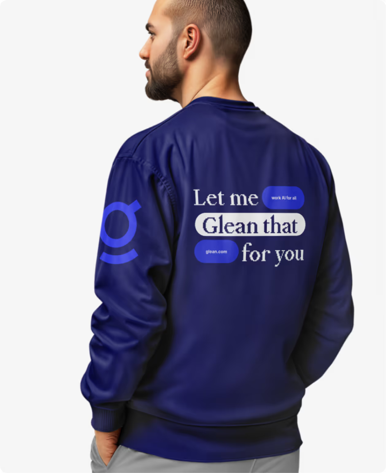
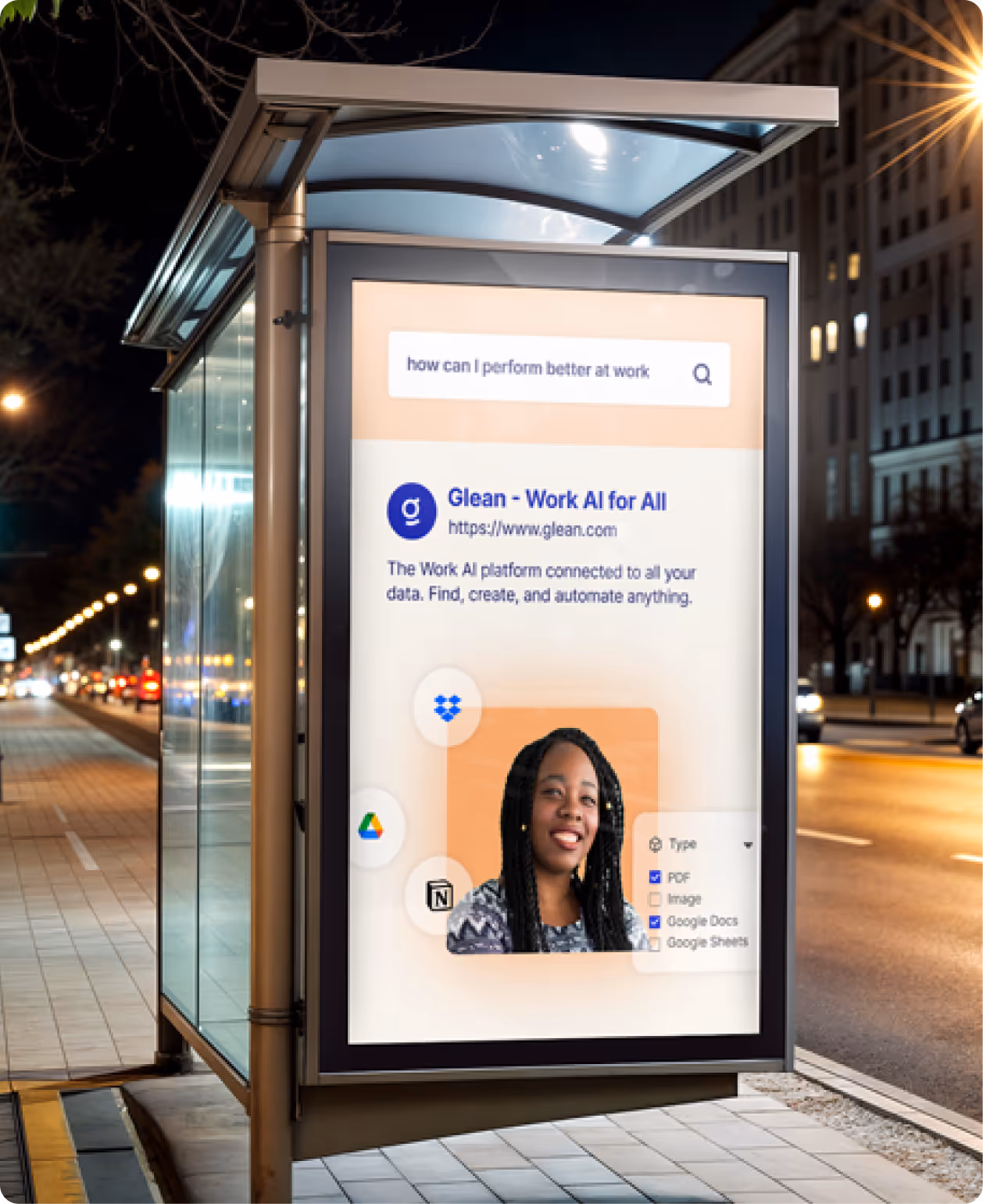
- Bring their brand to life through all marketing touchpoints including their website, OOH advertising, employee swag, office design and more

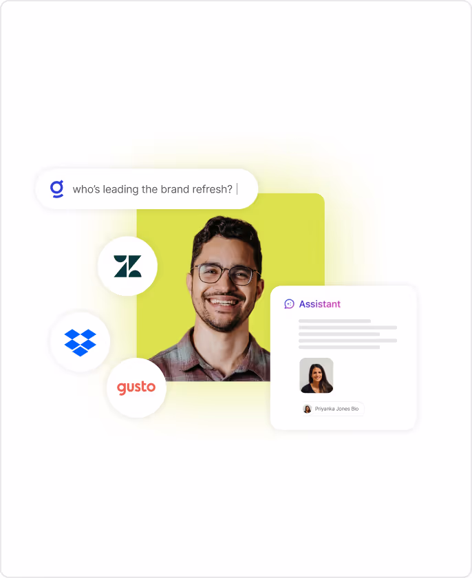
Glean’s brand purpose revolved around this idea of distillation—transforming raw data into clarity. This is reflected largely through the use of “soft color halos” as patterns and in combination with graphics, but also by embracing an overall minimalist design aesthetic.
By establishing the Sage Sidekick archetype we knew Glean had to reflect a balance of powerfully wise and wonderfully approachable. This archetype informed the typography, color palette and brand voice.


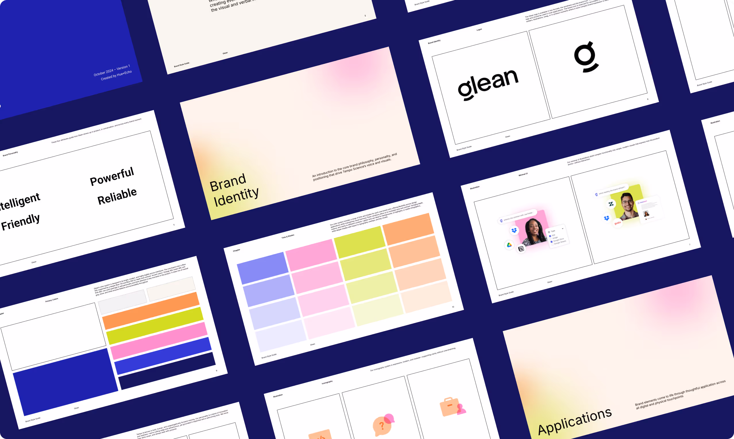
The gradient shapes symbolize connectivity, pinpoint accuracy and speed. The product is all about “the beauty of simplicity” by bringing structure and clarity to a user's workday so the brand needed to embody that idea. Minimalist design philosophies complement bold gradient circles to create a balance between the feelings of magic and calm.
Building from Glean existing palette, we subtly toned down their primary blue while using tints of that color in addition to other hues for a secondary color palette. To balance the overall playfulness of the palette we introduced a darker navy blue and embrace a lot of white space compositionally. In sum, this allowed us to retained some of the existing equity in their existing visual brand.


The primary goal of the website was to design and build something that did two things--showcased their new sophsticated brand and clearly communicated the why behind their product to enterprises looking to save time and money among their employees. Additionally, for credibility and to appeal to IT leaders the website needed to communicate the advanced AI and machine-learning technologies behind Glean’s tool.
Key Metrics
- Aligned Executive Team and other senior leaders on new brand positioning and design direction quickly and smoothly
- Product launch and site refresh drove a 30% increase in website traffic and 160% increase in inbound leads
- Social followers increased 8.5k (+28%) on LinkedIn, 1k (+275%) Twitter. Marketing ROI was up 106% due to 2x demo requests from Q4 to Q1


